In October 2012 I got my raised bed, built it up, filled it up and planted it for the first time in spring 2013. As a beginner, who has never been involved in growing vegetables before, I was really overwhelmed with the sowing, care and fertilization of the salads, carrots, fennel etc. Of course I read a lot in books, but who is supposed to remember all this?
There were already some apps with a lot of information, but in none of them you could put together the plants yourself, make additional notes, collect information yourself and manage different varieties of a genus. And not only for vegetables and herbs, but also for flowers, bushes, fruit trees and all other plants in the garden. In addition, I also wanted to write down tips and information from all possible channels like Twitter, Facebook, Instagram, Wikipedia and others somewhere. The gardener, the neighbor, a friend ... all give you useful tips and experiences that I wanted to collect.
So I looked for an app for all my memos and notes, one just for the garden todos, a diary app, several garden apps and Trello for bed management. So a lot of apps for the management of my garden. This seemed to me suboptimal.
So how else do you manage so much information sensibly?
Professionally I was and am self-employed and have always managed my projects with Filemaker. This is a database software for Mac, with which you can create databases "quite easily" yourself and design them as you like. So it was obvious that for my vegetable growing and gardening ambitions I would also create a kind of information collection and management database. The first thing I wanted to do was to create a timeline in which I could see at a glance what I have to do and when, from pulling forward to fertilizing and harvesting.
At that time this database only consisted of two screens, a list (with a timeline) and a detail view, in which I collected all kinds of information, but which was clearly arranged by topic.
Screenshots of the Filemaker file on iPad, 2013 (German)
Very soon, of course, I started to grow different varieties of one genus (for example tomatoes). Although the basic information was always the same, I still had to duplicate the whole data set for a new variety, but then only change the variety-specific details. So in the first extension I separated the "Plant" section into "Genus" and "Varieties" to avoid duplicating the information for a genus, which is also valid for all its varieties, for each of the varieties. So, if I was on the page of a variety, the most important information of the genus was taken from there and displayed.
Much later a diary was added to the database, which is now the most used tool with almost 2.000 (!) entries.
Screenshots of the Filemaker file on iPad, Diary, 2014 (German)
One of my first attempts to find out which data I want to collect in the diary and which fields I need for this.
Screenshots of the Filemaker file on iPad, 2016 (German)
First design attempts (well ;) towards app, first attempt of a start screen. The section "genus" was still called "info", "varieties" was called "plant" for different plants. Also the first attempts to assign different colors to the different areas. This version also with to-do list. Renamed from "Garden" (my garden administration") to "bioGartler" for a possible app (according to my blog).
Screenshots of the Filemaker file on the iPad, end of 2018 (German)
The individual areas have been given icons in the colors used before. The "i" stands for "info", later became "genus". There is still no bed or source management.
I implemented the bed and source management only in 2019.
Again and again I worked on the layout on the iPhone or mobile, which was very difficult, because there is simply not enough space on the screen for the wealth of information. But I have (hopefully) managed this as well over the years.
At some point I had the idea that other Gartler probably/probably would like to have such an app, too. But Filemaker as a tool was out of the question, you can download the app for free in the store, but it has two big disadvantages: first, as a single user it still can't synchronize (although Filemaker is an Apple subsidiary!) and second, you can only update with the desktop app on the original file. So I started to think of my own app, worked on the layout and spent the last two years developing a design that seemed "app-suitable" to me.
Screenshots of the Filemaker file on iPad, end of 2019
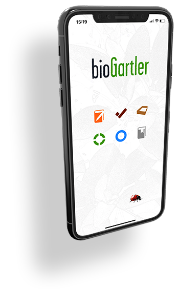
The version at the end of 2019 - with new icons and the ladybug that appears over and over again - comes quite close to the version of the app and was also the agency's target. While they were programming the app, I continued to refine the layout. For example, the background image was not added until early 2020, in my opinion a major plus in look and feel.
And for comparison the same screenshots of the app, July 2020
It was more difficult than expected to find a suitable agency, where the costs for this app are feasible but the "chemistry" to the employees/supporters is right. But even that was successful (after half a year), I found a very young, competent and likeable team.
But that is another story ...


Comments powered by CComment